Category: Advice
These are Swipes that throw off some good advice or wisdom.
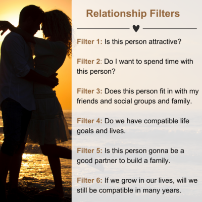
6 “relationship filters” for finding a partner
Was listening to @heydannymiranda podcast and the guest @justinkan listed out 6 “relationship filters” for finding a partner I’ve never heard.
Thought this was cool! Taken from my Apple Notes …
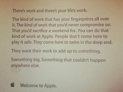
Apple’s employee onboarding message
A message Apple would send to all of it’s new employees to encourage them to be a little crazy and obsessive over the products they create.…
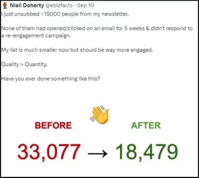
Email list cleaning
Having done this many times across many email lists, I can tell you it’s healthy for the email list in the long run, but a massive hit to the ego …
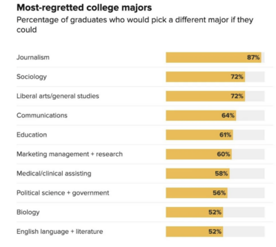
Most regretted college majors chart
This shows the college majors people most regret getting, usually due to a lack of opportunity the major gets vs the amount of effort/cost to acquire it.
Do you regret …
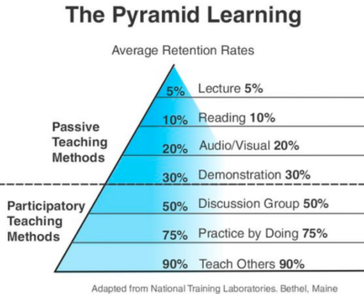
“Learning Pyramid” chart
This is a cool chart that shows how much people remember from different mediums of learning.
- 5%: Lectures
- 10%: Reading
- 20%: Audio/Visual
- 30%: A demonstration
- 50%: Discussing in a group
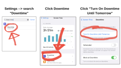
Have a better weekend with less screen time
Avoid mindlessly opening up social media or playing on your phone using Downtime on iPhone. It’s easy!
- Settings → Search “Downtime”
- Click Downtime
- Click “Turn On Downtime Until Tomorrow”
Within …
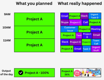
What you planned -vs- What really Happened
We can all relate to this….you plan all this stuff for the morning, and you end up working on a “little of everything” and end up getting nothing done 😬…
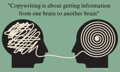
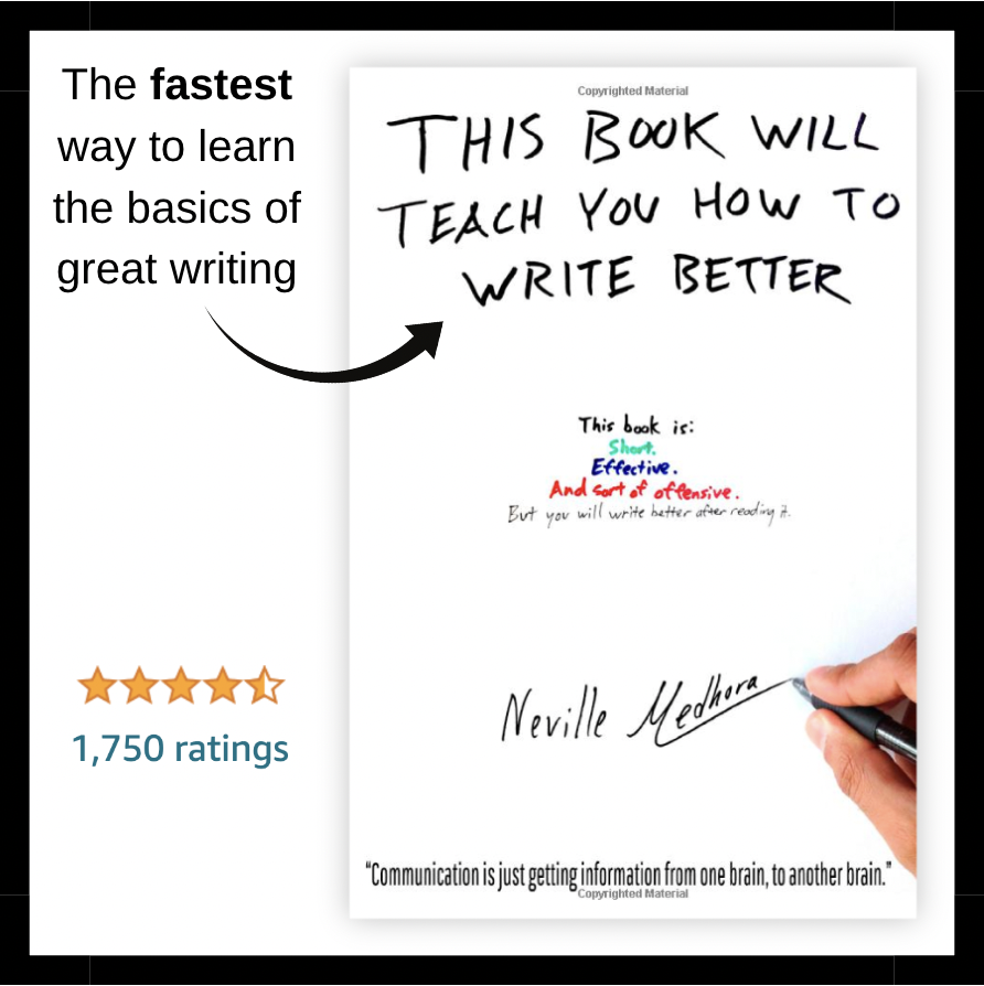
Copywriting is transferring information
The goal of great copywriting is to take what’s in your brain, and transfer it to someone else’s brain in the most efficient & sticky way.…

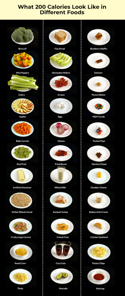
200 calories in different foods visual data
Each dish pictured here is 200 calories….but look at the volume difference of the left column vs right column!
I learned what a calorie was in 2010, and made my …
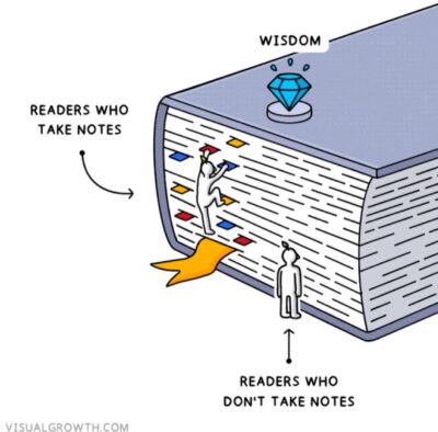
Take notes when you read
This cool graphic shows that if you take notes you can really retain the wisdom of books you read. I personally take all my notes in Apple Notes now, not …
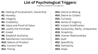
List of psychological triggers that make people buy
Originally listed out by Joe Sugarman in his book The AdWeek Copywriting Handbook, he identified 24 “triggers” that can cause people to purchase something. …

Take small steps
This image is a cool demonstration why it’s better to take smaller steps.
Instead of “I want to make $1,000,000 right now” try “I’m going to make $100 this week.”…
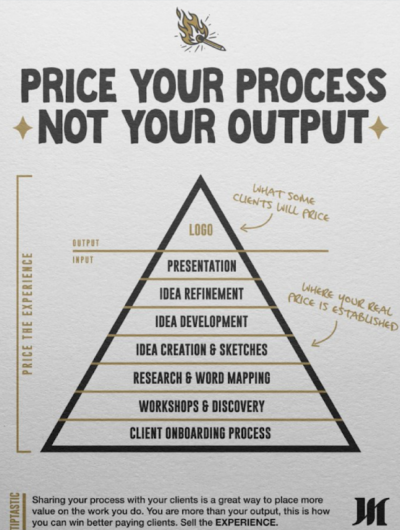
Pricing the process, not the output
As I’ve watched people move up the food chain from freelancer → agency owner, they will start pricing more like this.
A 1-person client may just want a quick-n-dirty logo …
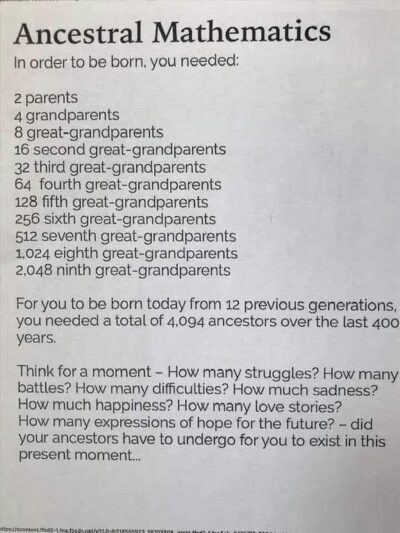
How many ancestors does it take to make YOU?
This is a fun little exercise that shows how many unique experiences alllllll combined and dovetailed into creating you.…