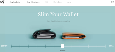
Bellroy Wallets USP-Focused Hero Homepage
Bellroy Wallets unique selling proposition is they are slimmer, but with the same capacity as bulky wallets.
In their hero section, they have an interactive slider where you can choose …
These are samples of high converting home pages. A good home page will make sure to direct users to an action (either continue to articles, or signup their information).
Bellroy Wallets unique selling proposition is they are slimmer, but with the same capacity as bulky wallets.
In their hero section, they have an interactive slider where you can choose …
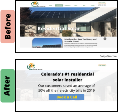
This before and after image is from a redesign tutorial in the Kopywriting Kourse.
It takes a sub-par hero section from a solar energy installation company’s home page and turns …
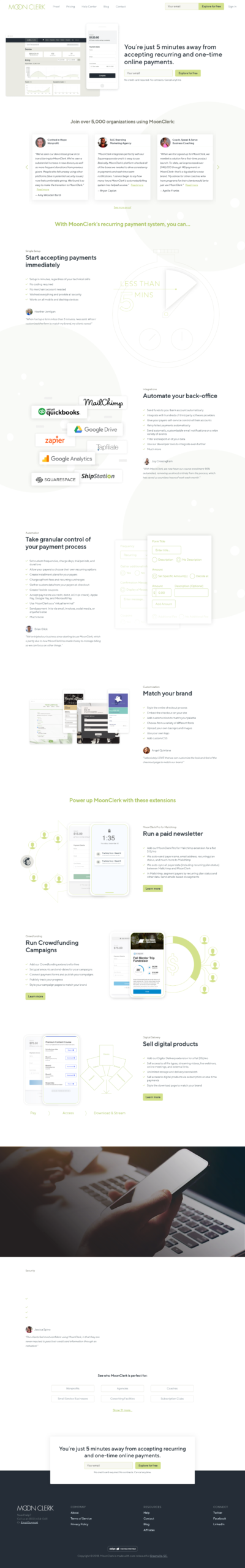
MoonClerk’s home page is really strong, from top to bottom.
Hello Sign does a great job combining a simple, direct message and CTA with an excellent explainer GIF.
It shows the tool in action and makes it really easy to …
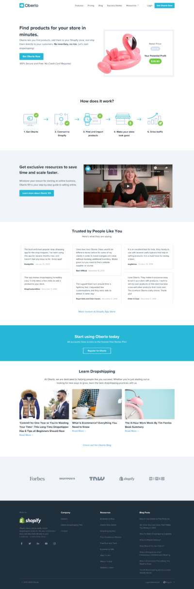
Oberlo’s home page is great.
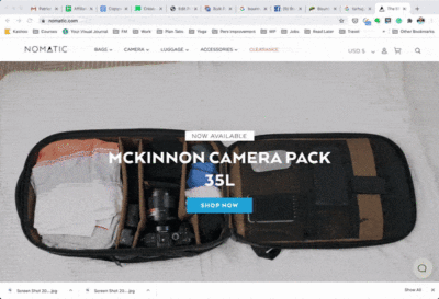
The hard part about selling online is buyers don’t get a chance to test out the product and see it in action. Nomatic’s homepage helps with this by including a …
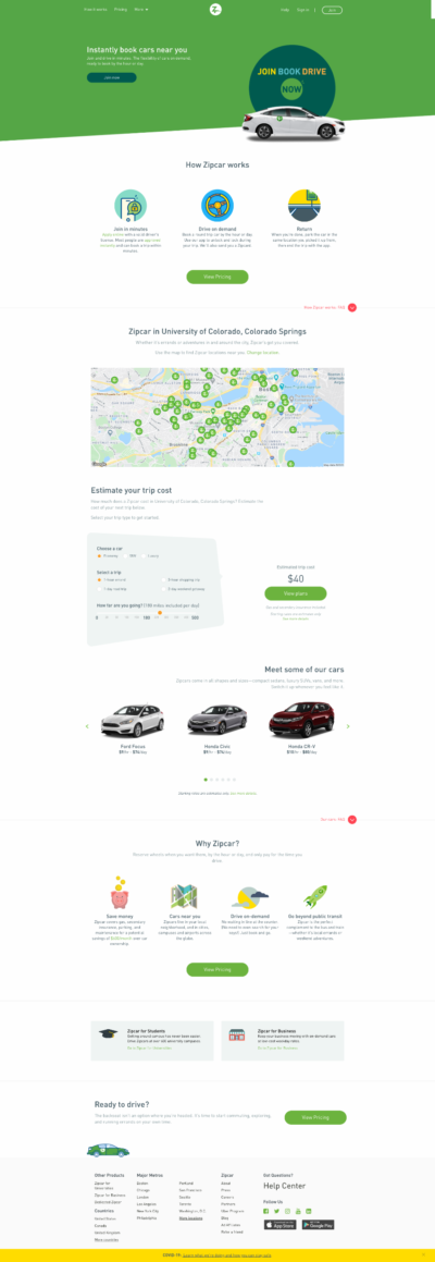
Zipcar’s home page is excellent.
Here’s how it’s built:
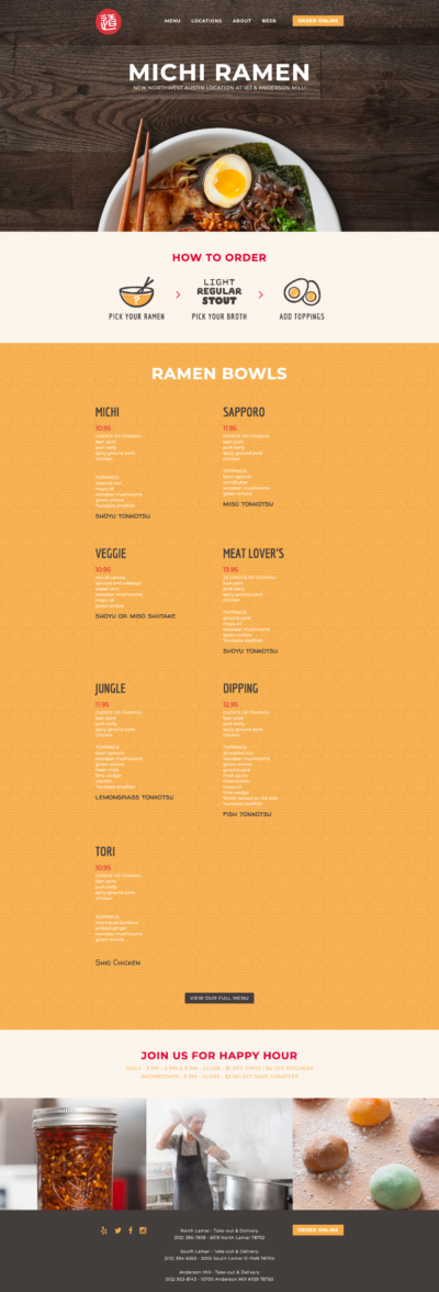
This is a great restaurant page. It’s got pretty much everything on one page:
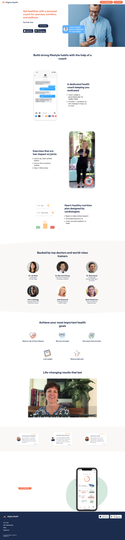
Mighty Health is a health and fitness app for people over 50.
They’ve got a great home page from top to bottom:
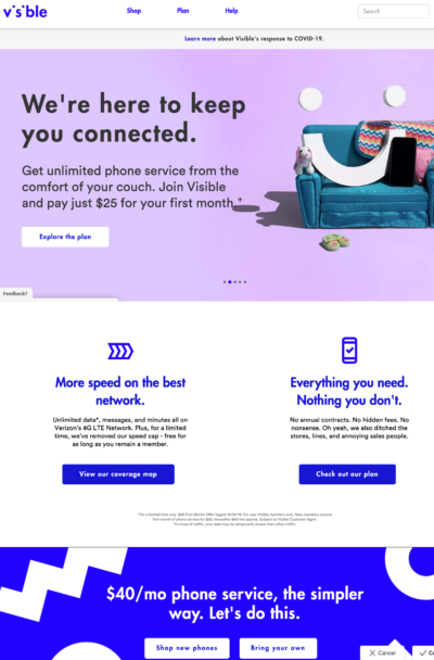
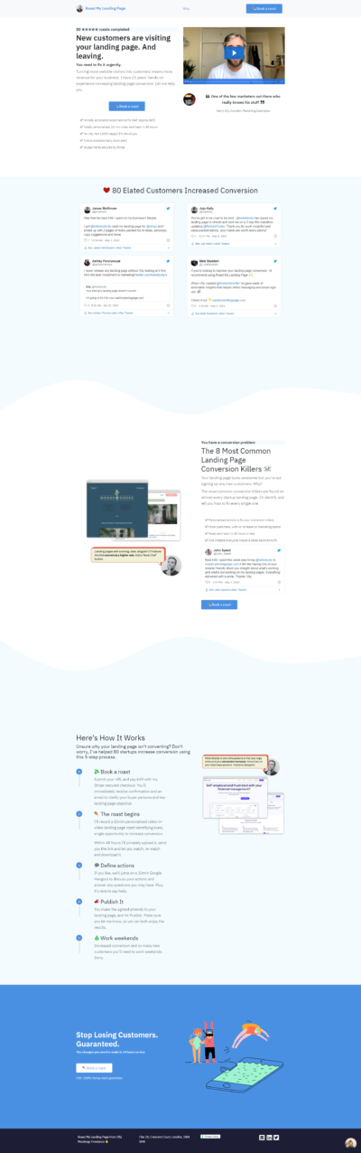
Most cell phone companies make it a NIGHTMARE to research and compare plans.
Weird names, complicated options, loads of fine print…
When I recently stumbled on Visible cell phone service, …
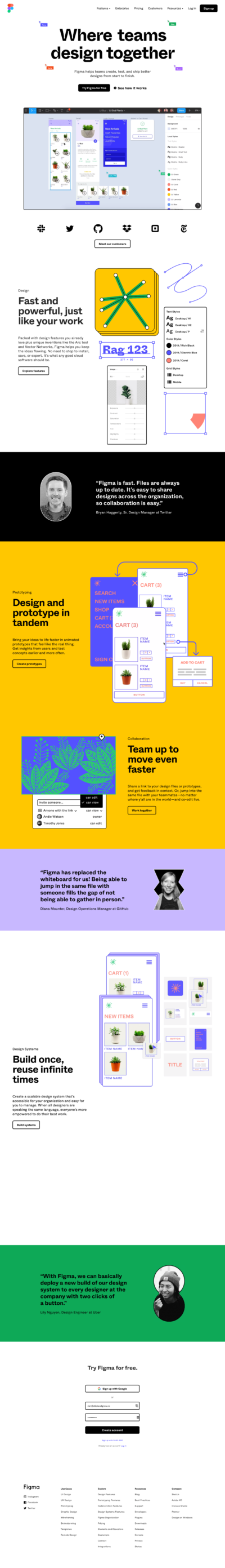
Figma is a collaborative design tool that can be used to build prototypes, wireframes, storyboards, (and pretty much anything else).
Their home page is great because:
This is a pretty cool sales page with powerful messaging, and a strong call to action right at the beginning.…

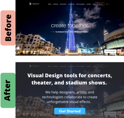
disguise is a collaborative software tool for BIG visual productions, like concerts, theater shows, and major outdoor events.
The problem is, their home page doesn’t do a good job explaining …

You want readers to immediately know what your site is about when they land on your page. That means using simple, clear language.
In this case, “Take your next steps …
When your target reader lands on your homepage, you have 5 seconds to show them your site is what they’re looking for.
Your headline is CRITICAL.
“Are you ready? Book …
ArborBridge is an online, private tutoring platform.
Their home page is great because:
This is a simple, clean, and effective site for a WordPress consultant.
It’s got a lot of great items on the page such as:
This is an extremely visual-rich page for a company selling hand drawn illustrations.
It’s got a fun and whimsical style, and definitely showcases the product well.
It also has a …
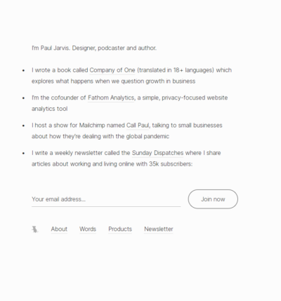
Paul Jarvis writes about businesses that deliberately stay small and focus on quality > quantity.
His homepage is simple, easy, and not pushy at all – it’s a great representation …